Using the Gauge Wizard
PERMISSIONS Users with security levels that allow the creation of LiveReports. Any security level in Autotask can be configured with this permission. Refer to Configure access to LiveReports Designer.
NAVIGATION Left Navigation Menu > Admin > Admin Categories > Features & Settings > LiveReports > LiveReports Designer
About gauges
Gauges measure performance against a goal that you set. The most commonly used gauge is the Angular (speedometer type) gauge - a half circle divided into segments, with each segment representing an increasing or decreasing value range. LiveReports includes three additional gauge types: Linear, Bulb, and Thermometer.

Depending on your data, the total value of segments on the gauge generally represents 100% of a goal or limit. The segments represent a level of success in meeting the goals or staying within the limits. In an Angular gauge, the needle represents the actual value of the specified data point. Its position indicates where that value falls within the levels of success.
TIP The data you include in the gauge does not actually have to be shown on the report. You can suppress it by placing it in a row, clicking on the row number for that row and choosing Suppress Rows. For more information about row options, refer to Sections, rows, and columns.
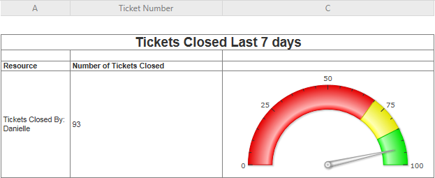
In our example, we will be adding a gauge to a report that shows the number of tickets a team of support technicians have closed during the previous 7 days.
How to...
Access the Gauge Wizard from the Report Editor. The wizard will walk you through the chart setup. To navigate through the wizard, click the desired tabs or use the navigation buttons located at the bottom of the page.
- Open a LiveReport in edit mode.To open the page, use the path(s) in the Security and navigation section above.
-
Click a cell in the Group Footer or Report Footer section to place the chart in.
- Click the
 gauge icon in the Tools menu.
The Gauge Wizard will open.
IMPORTANT Gauges use the calculations made on the report itself. Therefore, you cannot place a gauge at the top of the page because no data has been calculated yet. Always place your gauge at the end of the report, or in a group footer if you want to display data for that group only.
TIP Use the merge cells option to combine multiple cells for the chart, or resize the cell to the dimensions required for the chart, or it will appear very small.
- Click Finish. The window will close and the gauge will be placed into the selected cell.
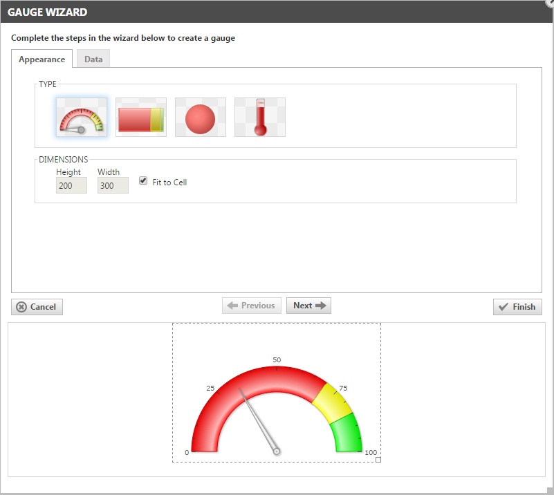
Use this tab to select the gauge type and dimensions of your gauge. Then, click the Data tab, or Next to add or edit data settings.
| Name | Description |
|---|---|
| Select the Gauge Type | Choose the type of chart that will be used. The following styles are available: - Angular - Linear - Bulb - Thermometer |
| Dimensions | Enter the height and width dimensions of your chart in pixels or select Fit to Cell to size your chart to the cell in which it appears. NOTE Use the merge cells option to combine multiple cells for the chart, or resize the cell to the dimensions required for the chart, or it will appear very small. |
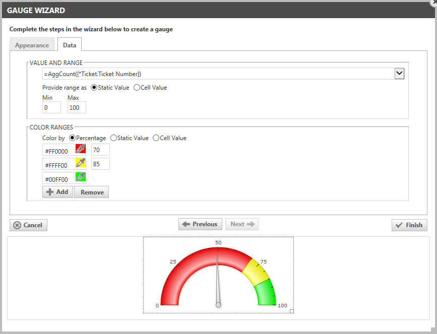
Use this tab to set the value and color ranges on your gauge. When the Data Appearance are set, click Finish to complete the gauge.
| Name | Description |
|---|---|
| Value and Range | |
| Value | Click the drop-down menu and select the cell from which to draw the gauge value. The field that is being measured is likely an aggregated value, such as a Sum, Average or Count. In our example, we are counting the number of tickets each team member completed in the previous 7 days. You could use the same type of gauge to sum a salesperson's won opportunities, or the average survey rating they received from customers. |
| Provide range as: Static Value, Cell Value | Select the option you prefer. If you select Static Value, the Min and Max fields will accept numbers, if you select Cell Value, the Min and Max fields will display a menu of cell options. |
| Min and Max | Enter a number or select a cell in each field to specify the minimum and maximum values of the range. In our example, we would like our technicians to close between 75 and 100 tickets per week, so we set a minimum of 0 and a maximum of 100. |
| Color Ranges: Note that Thermometer type gauges do not have multiple color ranges. | |
| Add/Remove | Click the Add or Remove buttons to add the color selector for each color range you want to add. Note that all but the last color selectors are followed by an empty field. These fields will specify the range limit for each color. The limit for the last color range is the Max value previously specified, so there is no field to the right of the color selector. |
| Color by Percentage, Static Value, or Cell Value | The color ranges you select will represent a percentage of the total, a range limit with the value you enter in the field, or a range limit with the value of a cell you select from the menu. |
| Color selector | Click to open the color selector and click your preferred color. Or, enter the 6 digit hexidecimal code for your preferred color. |
| Range limit | In the field next to the color selector, enter the numbers to specify the percentage or static value for the limit of the specified color's range or, for cell values, select from the menu. |
In the image below, you can see the gauge placed into a cell in the group footer. Because we suppressed the detail row, the individual tickets that were completed are not shown in the report.
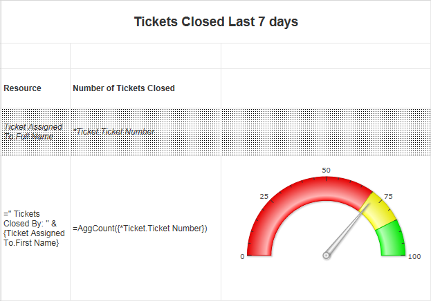
The generated report looks like this: